History of Cabl
At first there was nothing.
Then there was me.
If you know me, you know I talk about my catblock pfp a lot. I've always been proud of it, especially the most recent version of the time. It's been through many changes, and become uniquely mine with age. I enjoy talking about design, so let's look at my history.
May 2021 - The first pfp I used was this, a random image I pulled from the internet. You can still find this by searching "scratch cat block" or something similar online. This was far before my beginnings as a graphic designer:

May 2022 - The second pfp I used was stolen from GethinGamingYT, which I am just discovering now, and also realizing it was just an edited version of the first. I have no idea why I took this obvious step backwards. Perhaps I was just looking for something different. It bothers me now that the GIF gets slightly small_imageer on the second frame, but oh well.

October 2022 idk - The great quest in graphic design came much later. The following is my first attempt at a custom profile picture, made in Adobe Illustrator. It's cute of course, and totally matched my vibe. I purposely wanted it to look "hand-drawn", like some other profile pictures I'd seen. I also used a background of Scratch blocks to make it interesting.
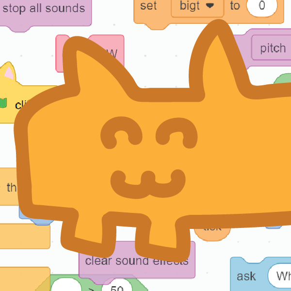
Shortly Thereafter - I'm not gonna lie to you, I'm not 100% sure about most of these dates,
but it's a general time frame. Believe it or not, all the custom pfps I've made for myself exist in a single
Illustrator file. But we have arrived to modern times. It brings back fond memories to rediscover who I have
been in the past. Time goes by so quickly, it hurts my heart to remember sometimes.
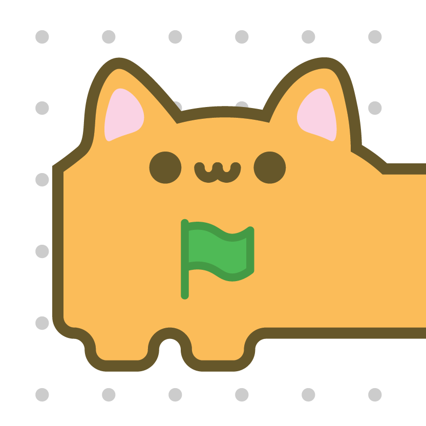
I eventually grew tired of the hand-drawn art style. I probably would have kept it longer if I had
remembered about the existence of the smoothing tool... but alas my modern internet persona was born! My
first iteration used the exact colors of the Scratch hat blocks. It took about 5 minutes to realize it
looked terrible at small_image sizes, so they were immediately changed to the match the following image.
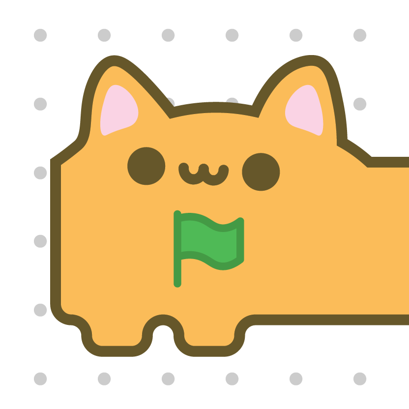
Also in a Short Period of Time - I didn't use a palette or anything, which in hindsight I really should have. But here I stood for a very long time, receiving minimal changes: bigger eyes, a rotated (dare I say "inquisitive"?) face, and an increase in the stroke weight. Eri, who I am forever indebted to, made my buff catblock banner around this time, too! Truly one of the greatest things.
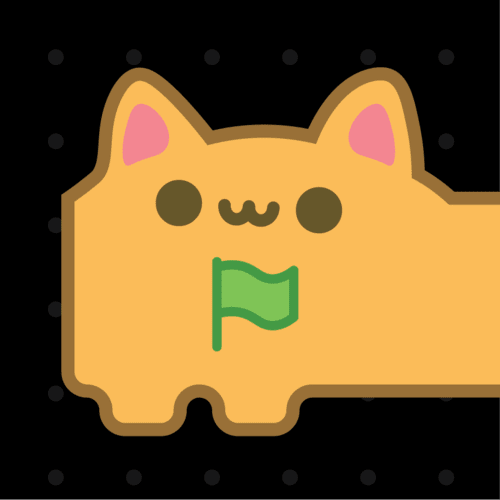
Eventually - One change was making the background dark. I actually adjusted the border on the catblock so it didn't get lost in the darkness.
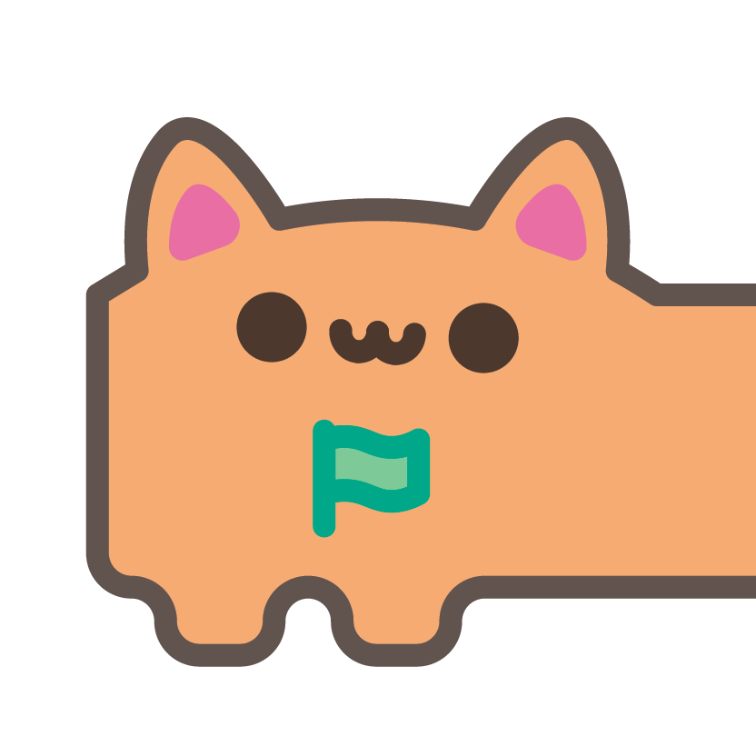
Very Recently - But because I am a perfectionist, the other day I felt a great desire to remake, or refresh, my identity. I must have freehanded the ears and head the first time around, but I was more strategic this time, making use of Illustrator snapping and shape merging instead. As I will always conclude, this is my favorite version of me yet! The colors were matched closely with the last version, but using a color library in Illustrator. The flag is also small_imageer, and everything inherits the same stroke weight, too.
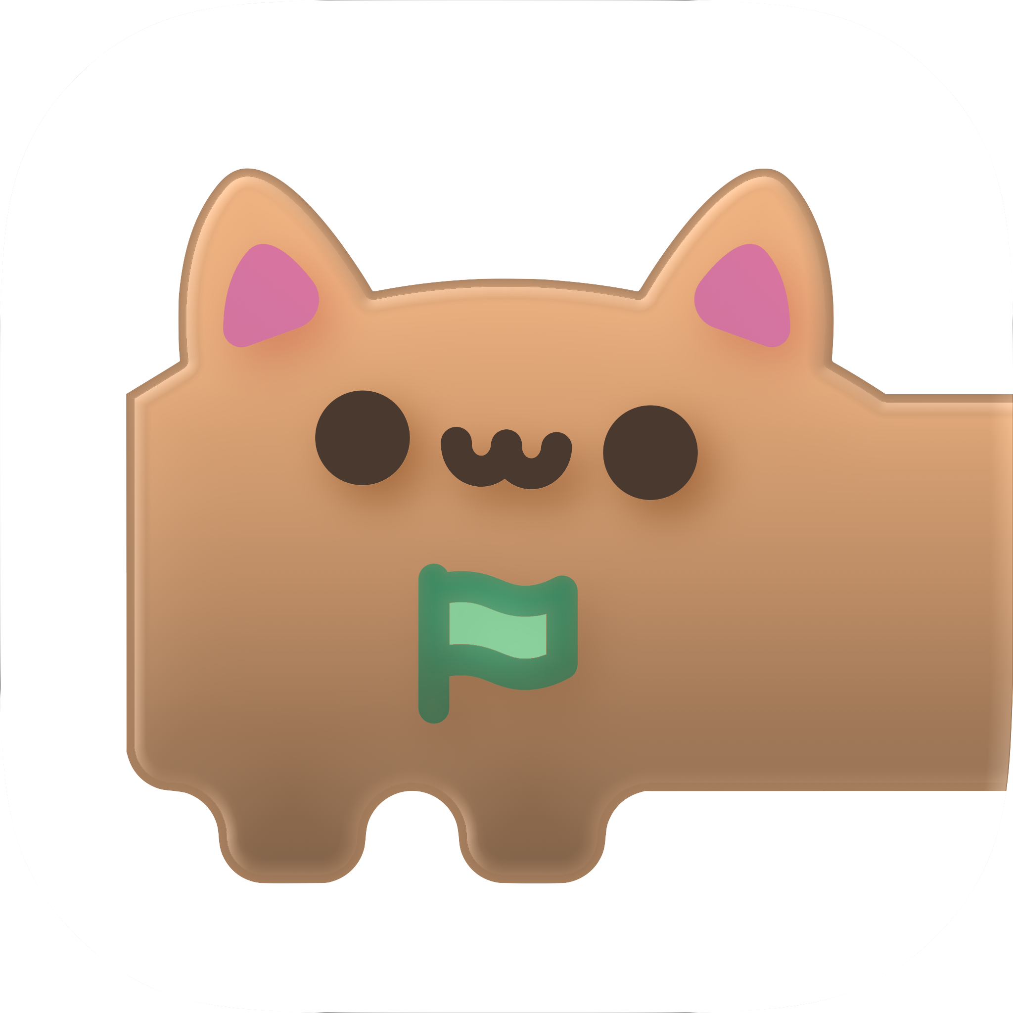
Even MORE Recently (UPDATE!) - With the introduction of Liquid Glass, and being an Apple fan, I've adopted a fun little glass-ified version of myself. I don't know if it will be temporary or permanent, but I'm quite fond of it!
Go Back